

Disclaimer: We’re going to be using some calculus and linear regression here. The math can be a bit boring, so bear with me. We’ll get to the fun applied part after getting through some of the need-to-knows. If you'd like to skip the theory and go straight to the application, click here.
Introduction
At Flint Analytics, we specialize in hyper-local marketing strategies for multi-location businesses. What that means is that we utilize geographic siloing to a large degree: every city we’re marketing to kind of exists in its own little strategy bubble.
While this detailed level of attention yields fantastic results for our clients, it can make my job as an analyst very difficult. Things may look great for the client as a whole, but how do we sift through the data quickly and efficiently to know when things might be going wrong in, say, just the Oklahoma City market?
There are several different methods for accomplishing this goal. Today we’re going to discuss how to use quadratic trendlines and their mathematical properties to quickly and efficiently identify potential problems in your multi-location data.
What is a Quadratic Trendline?
Generally, a quadratic trendline is a second-order polynomial which attempts to best fit a set of data. The equation will look something like this:
[math]y=ax^2+bx+c[/math]
In our application, the x-value will be a measure of time like {1, 2, …, n}, and the y-value will be our KPI (sessions, leads, organic traffic, etc). The most important part of this equation is [math]ax^2[/math], or the quadratic term within the equation, as it allows us to do some interesting analysis with regards to current trends and changes over time.
Let’s say you’re analysing traffic trends over a period of 60 days and your best fit quadratic trendline is:
[math]y=.00297x^2-.179x+58.637[/math]
In your data, the x-values are days {1, 2, …, n}, and your y-values are the actual session counts for each day. Graphing this equation alongside the actual data looks like this:
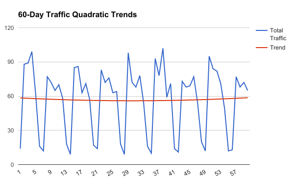
The blue line is the actual day-to-day data, and the red line is the quadratic trendline. You can easily notice two things:
- The day-to-day data fluctuates periodically every 7 or so days, suggesting some weekly trends.
- The trend line hits a low point somewhere in the late 20s or early 30s.
With the periodicity of the day-to-day data, it’s very difficult to visualize whether things are trending in a good direction over time. One thing we could do is find the slope of the best fit line without a quadratic term. In this case, our equation would be:
[math]y=.00286x+56.673[/math]
The slope tells us that things are technically trending positively over 60 days, but the coefficient .00286 is practically 0, which doesn’t really give us a lot to work with. This basically says “things are going up...barely.” The reason the quadratic equation gives us so much more to work with is that it has a critical point.
Warning: Calculus Ahead Let’s bring back the quadratic equation and take its first and second derivatives:
[math]y=.00297x^2-.179x+58.673[/math]
[math]y'=.00594x-.179[/math]
[math]y''=.00594[/math]
From the first derivative, we can find that there is a critical point somewhere around day 30:
[math]0=.00594x-.179[/math]
[math].179=.00594x[/math]
[math]x=30.13[/math]
From the second derivative, we know that the equation is convex. Recall these basic rules:
If y’’ > 0, y is convex
If y’’ < 0, y is concave
A concave function looks like a sweet Peyton Manning touchdown pass (it goes up then comes down), while a convex function is like a skater dropping into a halfpipe (you get it). Or, more precisely:
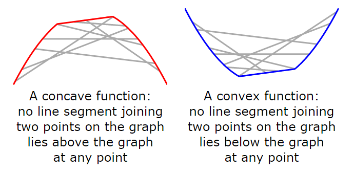
http://mjo.osborne.economics.utoronto.ca/index.php/tutorial/index/1/cv1/t
So we know that our trendline is convex and that it has a critical point around day 30. What that means from an analytics standpoint is that during the 60 day period of analysis, things had started off trending in a negative direction before they began trending positively around day 30. Maybe we started a new ad campaign on day 30? Maybe our luck turned around? The answer is irrelevant to the issue at hand: what’s important is that we now have a mathematical way of breaking out trends into two date ranges separated by a critical point.
Interpreting Trends with Convex and Concave Curves
At any specific point in time, a quadratic trend can exist in 1 of 6 states, visualized below.
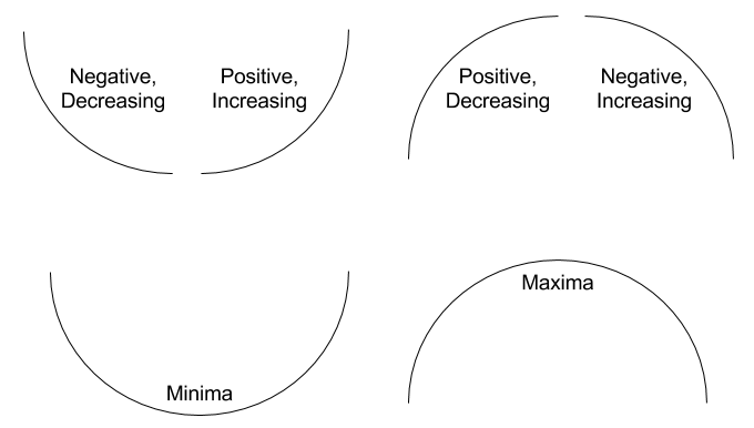
If a trend is in the Negative, Decreasing state, it is losing value over time but at a decreasing rate. This is important, because it tells us that each successive day is losing less value than it lost the day before and the trend is approaching a critical point. When the trend passes the critical point, it will generally move into the Positive, Increasing state, which is commonly referred to as hockey stick growth.
If a trend is in the Positive, Decreasing state, it is experiencing diminishing returns. A value in this state should be monitored for future changes, as passing the critical point will take it into the Negative, Increasing state. In the latter state, value is diminishing at an increasing rate overtime, resembling a nosedive.
If your trend is in the Minima state of a convex curve, it is expected to begin hockey stick growth the next day. If your trend is in the Maxima state of a concave curve, it will begin its nosedive the next day.
Translating the Math to Google Sheets or Excel
Let’s take our data and create a report like this in Excel or Google Sheets:
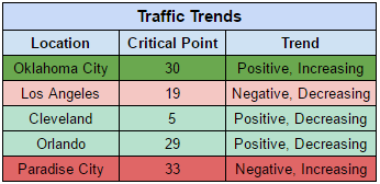
This report allows us to quickly visualize the trends of our target cities. Each individual location will require the same analysis that I outline below, so as you’re reading, keep in mind that you will have to replicate this process multiple times.
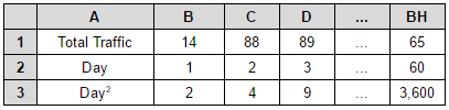
Recall that we will need the actual day-to-day data, a set of days relative to 1, and the squared days. So, our data may look like this, where the grey-shaded cells correspond to the cell column and row references:
In another table, we will estimate the quadratic trendline using the linest() function, as well as perform the calculations necessary to find the critical point and the trend. Let’s say that we’re placing our data manipulations on the same sheet as the data table, starting at row 5. Our output for, say Oklahoma City, will look like this:
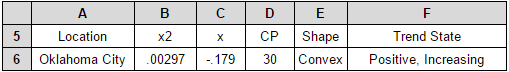
Before getting into the calculations, let me explain the data contained in each column.
- x2 – the coefficient on the quadratic term in the linear regression
- x – the coefficient on the x term in the linear regression
- CP – the critical point calculated from the linear regression
- Shape – whether the curve created by the linear regression is convex or concave
- Trend State – whether we are currently seeing the metric of interest increase or decrease and the acceleration of the change
Now, let’s look at how to generate these calculations.
The Linear Regression (Columns B and C)
Here we use the linest() function to generate a regression equation in which Total Traffic is the dependent variable and Day and Day2 are the independent variables. The linest() function spreads each coefficient across several cells, so in order to contain our output to the first two coefficients, we use the index() function as such:
Cell B6
=index(linest(B1:BH1,B2:BH3),1)
Cell C6
=index(linest(B1:BH1,B2:BH3),2)
The Critical Point (Column D)
Return to the general form of our quadratic equation:
[math]y=ax^2+bx+c[/math]
In order to find the critical point for this equation, you need to take the derivative, set the derivative equal to 0, and solve for x. Generally, this will always look like this with any second order polynomial:
[math]x=-b/2a[/math]
In our application, this general form translates to:
=(-1*C6)/(2*B6)
function to this equation:
Cell D6
=round((-1*C6)/(2*B6))
Curve Shape (Column E)
Curve shape is determined entirely by the sign of the quadratic term, and can be calculated very simply with a nested IF statement:
Cell E6
=if(B6>0,"Convex",if(B6<0,"Concave","Linear"))
Note that we have added the condition Linear as well. It’s very rare that trend data will be absolutely flat, but this would occur if the coefficient on the quadratic term was 0. This is a catchall for that extremely rare case only, and in practice, you will most likely never see any truly linear trends with this method.
Trend State (Column F)
Finally, we get to the point of this entire debacle: estimating the trend state of our data. Recall the 6 states we can be in, depending on the shape of the curve:
- Negative, Decreasing
- Positive, Increasing
- Minima
- Positive, Decreasing
- Negative, Increasing
- Maxima
These states are based entirely on the current time relative to the critical point and the sign of the coefficient on the quadratic term. We have calculated all of this data, so now we can simply use a sequence of if statements to determine the state.
Cell F6 =if(and(E6="Convex",60<D6),"Negative, Decreasing",
if(and(E6="Convex",60>D6),"Positive, Increasing",
if(and(E6="Convex",60=D6),"Minima",
if(and(E6="Concave",60<D6),"Positive, Decreasing",
if(and(E6="Concave",60>D6),"Negative, Increasing",
if(and(E6="Concave",60=D6),"Maxima",))))))
Note that I’m using the number 60 as a placeholder for the current date, since we are using rolling 60-day data for this example. This can be replaced with any variable that suits your analysis.
I spend the majority of my days staring at spreadsheets trying to figure out better ways of organizing and visualizing complex marketing data. If you have an analysis problem you’d like more help on, feel free to email me at patrick@flintanalytics.com or call (317) 993-3411.


